L o a d i n g
Case Study

Saurjya Acharya's Visual Portfolio

My portfolio was redesigned with a single focus, which was clarity over decoration. Instead of just showcasing projects, the website is built to communicate who I am, what I do, and why it matters within the first few seconds. It is tailored specifically for founders who value speed, clarity, and strong decision making.

The Problem

Most portfolio websites look visually appealing but fail at communication. Mine was no different.


There was no clear positioning. It did not explain who I am or what I specialize in. For founders, this creates friction. If they cannot understand your value instantly, they move on. The experience itself was forgettable. The interface lacked structure, the visual identity was weak, and interactions felt minimal. It did not represent authority, and more importantly, it did not represent my standards.

The Solution

I rebuilt the portfolio using Framer with a clear objective—make it communicate before it impresses. The entire structure is designed around positioning. The first screen immediately answers key questions about who I am and what I offer. Every section flows with intent, guiding the viewer through my work, thinking, and approach.


UI and motion were used strategically to create impact without overwhelming the experience. Every interaction supports clarity instead of distracting from it. Instead of a collection of projects, the website works as a narrative that builds trust.


Beyond structure and visuals, I focused on reducing decision fatigue. Each section has a purpose, each message is direct, and there is no unnecessary noise. The goal is simple—help the right people understand my value quickly and move closer to working with me.

The Conclusion

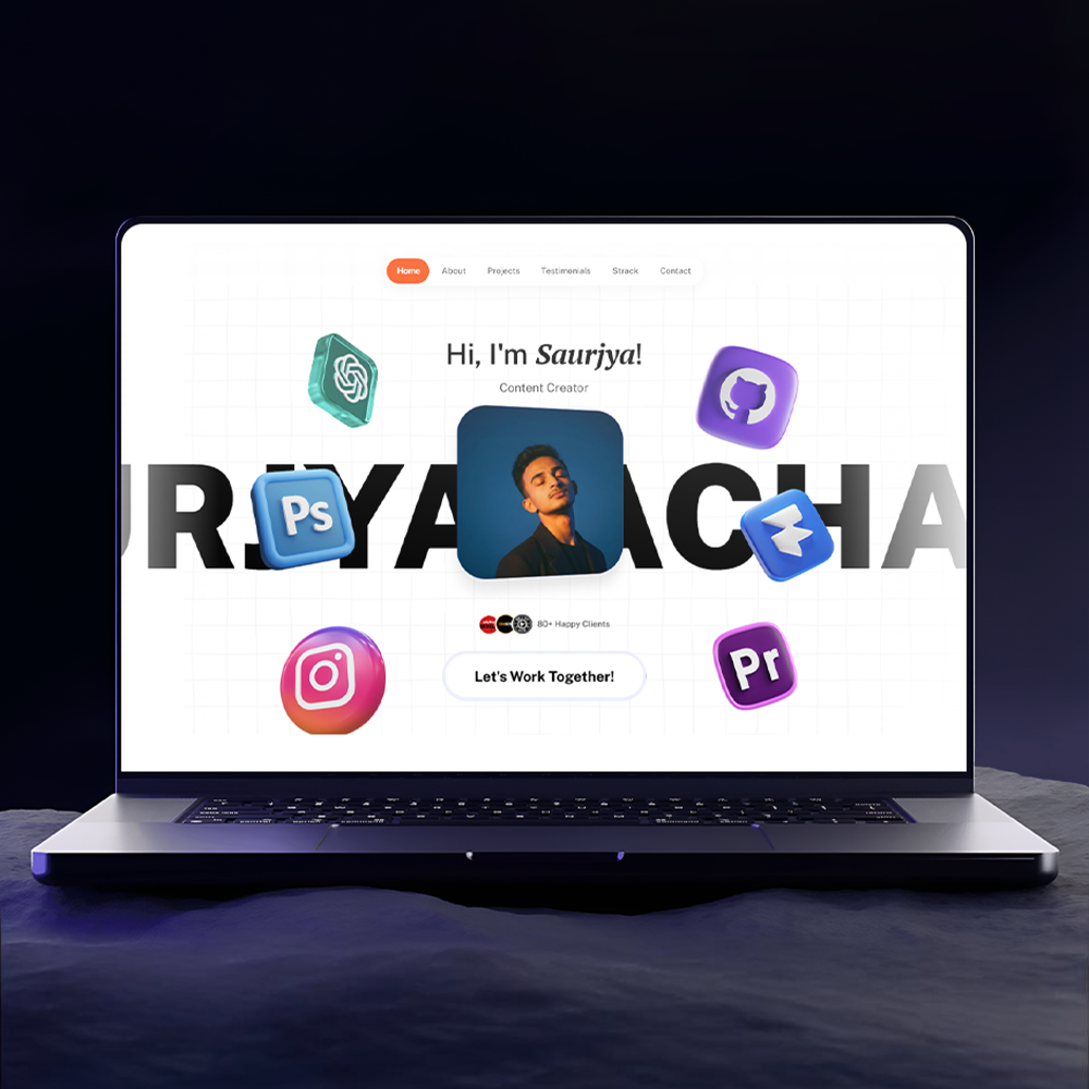
This portfolio is not just a display of work. It is a communication tool.


It positions me clearly, removes confusion, and creates a direct connection with the right audience. Instead of making people figure things out, it gives them a reason to stay, understand, and trust. More importantly, it sets a standard for the kind of work I want to attract. It filters out the wrong audience and speaks directly to founders who value clarity, execution, and strong design thinking.

  • Clear positioning
  • Defined target audience focus
  • Stronger visual hierarchy
  • Improved typography system
  • Intentional motion and micro interactions
  • Structured storytelling across sections
  • Cleaner UI with better spacing and layout
  • Consistent design system across the entire site
  • Conversion focused sections and flow

Get In Touch star

Get In Touch star

Get In Touch star

Get In Touch star

Get In Touch star

Get In Touch star

Get In Touch star

Get In Touch star

Get In Touch star

Get In Touch star

Get In Touch star

Get In Touch star

Contact me

Contact me

Contact me

Contact me

Contact me

Contact me

Contact me

Contact me

Contact me

Contact me

Contact me

Contact me